2 Descriptive statistics
Before we learn about statistical tests or statistical models, we will cover some basic measures that are used to describe data. The basic measures fall into two categories – measures of central tendency and measures of dispersion. What is the typical value for some variable? How are the observations spread out or dispersed around that value? This chapter also introduces you to party identification, at least how it is measured. The final part of the chapter focuses on interpreting and explaining statistical output that describes the distribution of party identification in the electorate today. For a background on the meaning and importance of party identification, take a look at “Americans Hate to Love Their Party, but They Do!” (Kaufmann, Petrocik, and Shaw 2008a).
2.1 Measures of central tendency
One of the common things we use data for is get a sense of the typical value for some variable of interest. What percentage of WMU students graduate within four years of first time enrollment in any college? What proportion of the electorate approves of the president? What proportion of the Michigan electorate voted “yes” on proposal 1? What percentage of a third grade class reads at grade-level? What is the average salary of a mid-career alum of WMU? Are people who are given a medical treatment better off, on average, than people who do not receive the treatment? Does a government program make people who participate better off?
Mean
Most of us learn something about the “average” very early in our lives and I assume most of you are comfortable with the concept of and even the calculations behind an average. In statistics, the average is designated as the mean.
There are a handful of mathematical symbols that we will use over the course of the semester. The formula for the mean introduces two of those symbols: \(\mu\) (the greek letter we will use to designate the mean) and \(\sum\), the sum, typically used more formally to specify the sum from the first observation to the nth observation:
\[\sum_{i=1}^n\]
To calculate the mean, you simply sum up all of the values of a variable for the observations in your dataset and divide by the total number of observations. In symbols, for any variable X:
\[\mu=(\sum_{i=1}^nX_i) / n \]
Median
An alternative measure of central tendency is known as the median. All of you are familiar with the percentile associated with a test score. If you score in the 98th percentile, you are in the top 2%. If you score in the 2nd percentile, you were outscored by 98% of the people taking the test. The median is simply the 50th percentile – as many above as below. The median is not necessarily the midpoint of the measure or scale, it is the 50th percentile of the people you observe. So you could have a 1 to 7 scale where responses are clustered evenly one-third at “1”, one-third at “2” and one-third at “3”. The median here would clearly be “2”, even though the midpoint of the 1-7 scale is “4”.
If a distribution is skewed (to the left or to the right), the median is often used as a measure of central tendency, rather than the mean. We typically use the median, for example, to describe the central tendency of household income. If you had a neighborhood of 100 households, all with income near $50,000, then the average income would be $50,000 and median would be about $50,000. If a high income household ($1.5 million per year) moved to the neighborhood, then average income would go up by $15,000, but the median would be unchanged at a little over $50,000.
Mode
A third measure of central tendency is the mode. The mode is simply the single most frequent response. This measure of central tendency is obviously most useful if a single response describes a large number of observations.
The normal distribution is a special case
In the special case of a normal distribution or bell-shaped curve, the mean, median and mode are the same number. Figure 2.1 reproduces a normal distribution. The responses are symmetrical, as many above as below the average and with the most responses right at the average. This distribution obviously doesn’t fit all of the variables we observe, so it also makes sense to think about which measure of central tendency might be useful for data that have other distributions.
Figure 2.1 The normal distribution
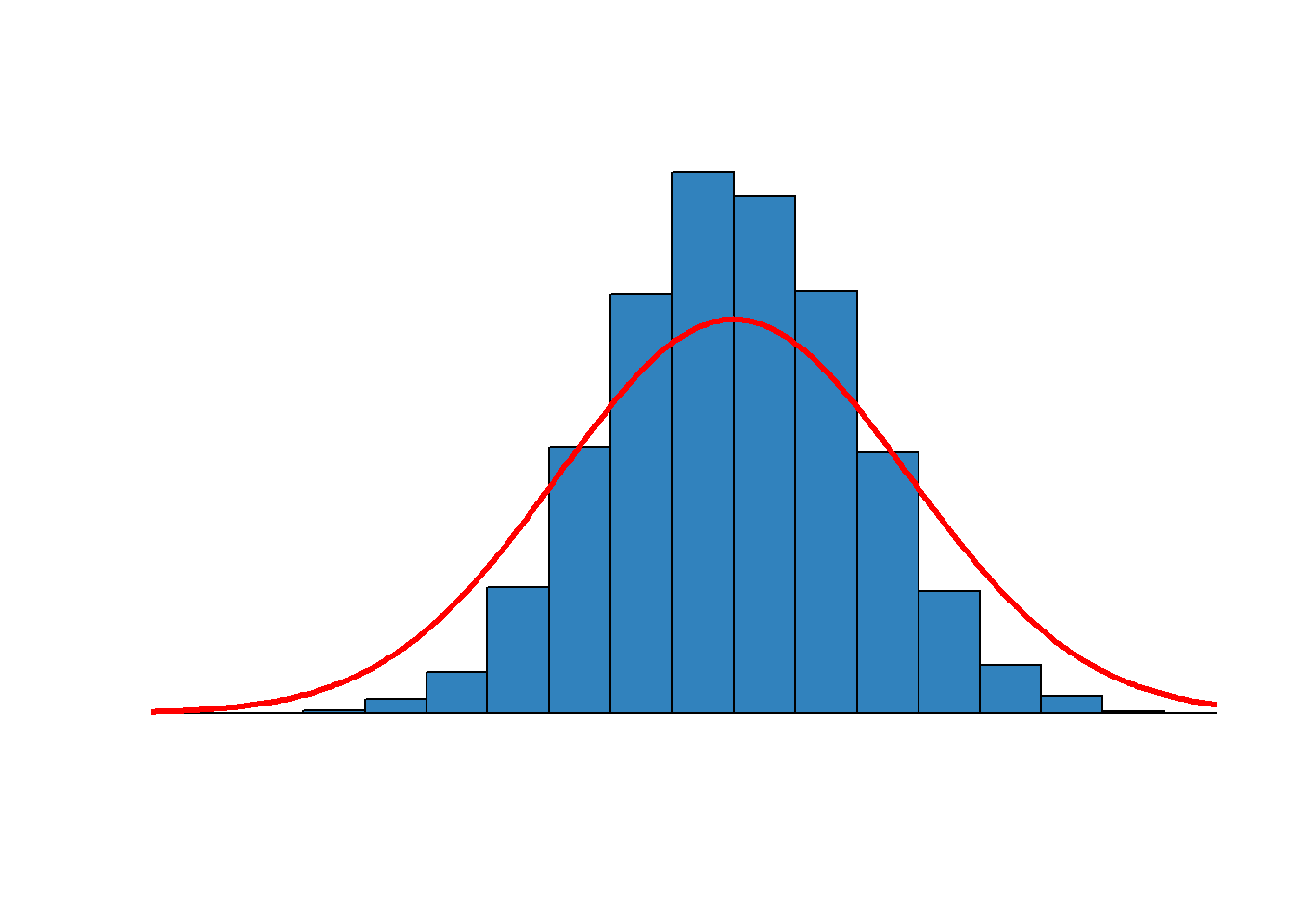
Figure 2.2, below, reproduces a skewed distribution – skewed toward the small number of very high values on the right. In this case, the mean would be higher than the mode or the median – higher since there are a few very large values that inflate the mean. If you wanted to report a typical value, the median would be a more accurate number
Figure 2.2. A skewed distribution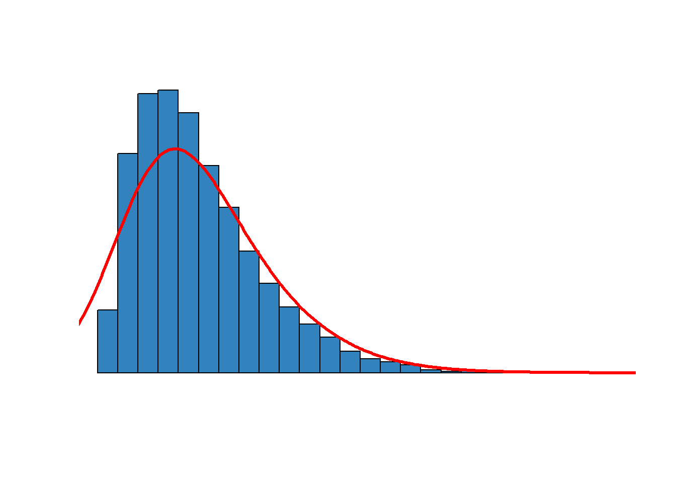
2.2 Measures of dispersion
In addition to understanding what a typical value may be, we also want to know if many observations are clustered around one set of numbers or if the observations are spread out or dispersed across many different responses. To get a sense of this, we rely on measures of dispersion.
Variance
The most common way to describe dispersion is with variance. For any variable X, the variance (designated \(\sigma^2\)) is calculated once we know the mean.
\[\sigma^2 = \frac{n}{n-1}( (\sum_{i=1}^n (x_i - \mu)^2) / n)\] The variance is, in words, the average sum of the squared distances from each observed value and the sample mean, adjusted for the size of the sample. The second term (\(n/n-1\)) implies that the variance is going to be inflated for small samples (adjusted up by 5/4 for 5 observations), but not at all for large samples (adjusted up by 1000/999 for 1,000 observations).
This simplifies to:
\[\sigma^2 = \frac{( \sum_{i=1}^n (x_i - \mu)^2}{n-1}\]
The first thing to notice about this formula is that if everyone is identical, then the variance will be zero since everyone’s individual value for X would be equal to the mean. If you are looking at the distribution of age in a classroom and everyone is the same age, then the variance is zero.
Key point: Remember that the size of the variance – zero or large – doesn’t tell you anything about the level of X – you could have zero variance for a group of old people (average age is high) or for a group of young people (average age is low). If you compare two groups, the group with the higher variance is more spread out across the possible responses, and the group with the lower variance is more concentrated in a few categories near the mean.
Standard deviation
We typically don’t actually report the variance, but instead use the standard deviation. The standard deviation (\(\sigma\)) is simply the square root of the variance. Variance=4 means standard deviation=2.
Why not just report and use the variance? Standard deviation is preferable since the unit of measurement is the same as the mean. If you report the mean age of a group of students is 22 years, then it is useful to report a measure of dispersion that is also measured in years rather than years-squared. Since we square the difference between each observation, the metric of variance is always X2 which is not as easy to explain as something that is scaled in the same way as X.
2.3 When are descriptive statistics useful?
Interval variables (very useful)
There are many different kinds of variables – a survey might capture and record information about your age, race, level of education, or gender. These are different types of variables – age is a scale in years and the difference between a 25 year old and 30 year old (5 years) is the same as the difference between a 55 year old and 60 year old (5 years). This is what is known as an interval variable. Other examples of interval variables might include time, distance, weight, temperature, pressure.
Ordinal variables (useful)
Some variables have a meaningful order but are just a series of categories that indicate higher or lower. Education levels are a good example: there is an order and higher values indicate more education. The specific way that we order education in the ANES is reproduced below.
Table 2.1 Education categories in the ANES
| Meaning | Number |
|---|---|
| Refused | -9 |
| Don’t know | -8 |
| Less than high school credential | 1 |
| High school graduate - High school diploma or equivalent (e.g. GED) | 2 |
| Some college but no degree | 3 |
| Associate degree in college - occupational/vocational | 4 |
| Associate degree in college - academic | 5 |
| Bachelor’s degree (e.g. BA, AB, BS) | 6 |
| Master’s degree (e.g. MA, MS, MEng, MEd, MSW, MBA) | 7 |
| Professional school degree (e.g. MD, DDS, DVM, LLB,JD)/Doctoral degree (e.g. PHD, EDD) | 8 |
| Other {SPECIFY} | 95 |
We know that a higher number means higher levels of education but we can’t really say that the difference between 4 and 5 (Associate degree vocational versus academic) is the same in as the difference between 6 and 7 (completing a BA compared to completing a Master’s degree). We treat -9, -8, and 95 as missing values. In general, variables that have meaningful order, but intervals that are not uniform, are known as ordinal variables.
Categorical variables (not useful at all)
The third type of variable just attaches numbers to categories– categories like race or region (the order of categories is arbitrary). These are known as categorical variables. Descriptive statistics are not useful for categorical variables since it makes no sense to take the mean of that type of variable: higher or lower is just an artifact of what number we attached to what categories. OK, you could use the mode – but not the median or the mean.
Descriptive statistics are most useful for interval variables like age. Descriptive statistics can be useful for ordinal variables – where categories have a meaningful order (like whether you strongly agree or disagree with some statement, or your party id coded from “1” Strong Democrat to “7” Strong Republican). Many of the measures we rely on in social sciences are ordinal – order matters but it gets fuzzy after that – so we apply the tools of statistics knowing that our measures are second-best. This is one type of the many measurement challenges we face.
2.4 A starting point: party identification
All of the papers and problem sets you prepare for this class are based on data collected in the American National Election Study (ANES), a survey of approximately 5,000 vote-eligible citizens collected and distributed each election year by the Inter-university Consortium for Political and Social Research (ICPSR) in Ann Arbor. The survey data inform work in American politics on mobilization and turnout, campaign effects, and provide insights into how party identification changes over time. The data collection effort is funded by the federal government (through the National Science Foundation). All of the data collected under the ANES (dating back to 1948) are free and available for download (S. U. American National Election Studies [ANES] University of Michigan 2025).
If you want to see question wording or other details, you have to access the complete ANES codebook on ELearning. Some variables may include responses like DK (“Don’t know”) or NA (’Not Available”). The codebook may indicate these responses are associated with a number, but we treat these as missing values.
DO NOT PRINT THE COMPLETE CODEBOOK (800 pages!)
Party identification is based on responses to a couple of questions:
Generally speaking, do you usually think of yourself as a [DEMOCRAT, a REPUBLICAN / a REPUBLICAN, a DEMOCRAT], an INDEPENDENT, or what?
Would you call yourself a STRONG [Democrat / Republican] or a NOT VERY STRONG Democrat / Republican]?
Do you think of yourself as CLOSER to the Republican Party or to the Democratic Party?
Responses to those questions permit us to place individuals in one of seven party identification categories.
Party identification in 2024
Individual responses from the 2024 survey are summarized in Table 2.2. Note that the responses include the numbers -8 and -9. These numbers indicate that there is no data for those respondents – the individual skipped or refused to answer one of the questions. Nearly every respondent offered a response to the question.
Table 2.2 Frequency table for party identification in 2024
| Response | n |
|---|---|
| -9 | 31 |
| -8 | 5 |
| -4 | 2 |
| 1 | 1314 |
| 2 | 616 |
| 3 | 714 |
| 4 | 380 |
| 5 | 716 |
| 6 | 577 |
| 7 | 1166 |
The frequency table above just gives us the numbers of people in each category, but we are typically more interested in the percentage. The table below improves on Table 2.2 in couple of ways. In addition to calculating the percentage, this table now labels the responses (so you can see, for instance that a “1” is a Strong Democrat). This table also uses survey weights to accurately translate the ANES respondents into a nationally representative sample. We won’t discuss the technology or numbers behind survey weights very much, but all of the results you will be relying on use the appropriate weights. This is our best estimate for the distribution of party identification of eligible voters (citizens, 18 and over) in the United States.
Table 2.3 Party identification in 2024, weighted
| Party identification | % |
|---|---|
| Strong Democrat | 22.8 |
| Not very strong Democrat | 11.0 |
| Leaning Democrat | 13.4 |
| Independent | 7.7 |
| Leaning Republican | 14.1 |
| Not very strong Republican | 10.2 |
| Strong Republican | 20.8 |
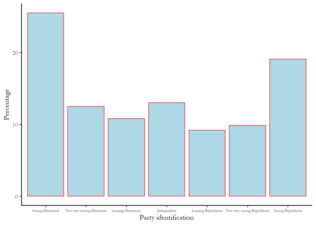
We could also summarize these numbers with a simple bar chart. The bar chart highlights the fact - surprising to some - that two most common responses to this questions are Strong Democrat and Strong Republican. The table confirms that there are more Strong Democrats than Strong Republicans, but only by a narrow margin.
Figure 2.3 Party identification, 2024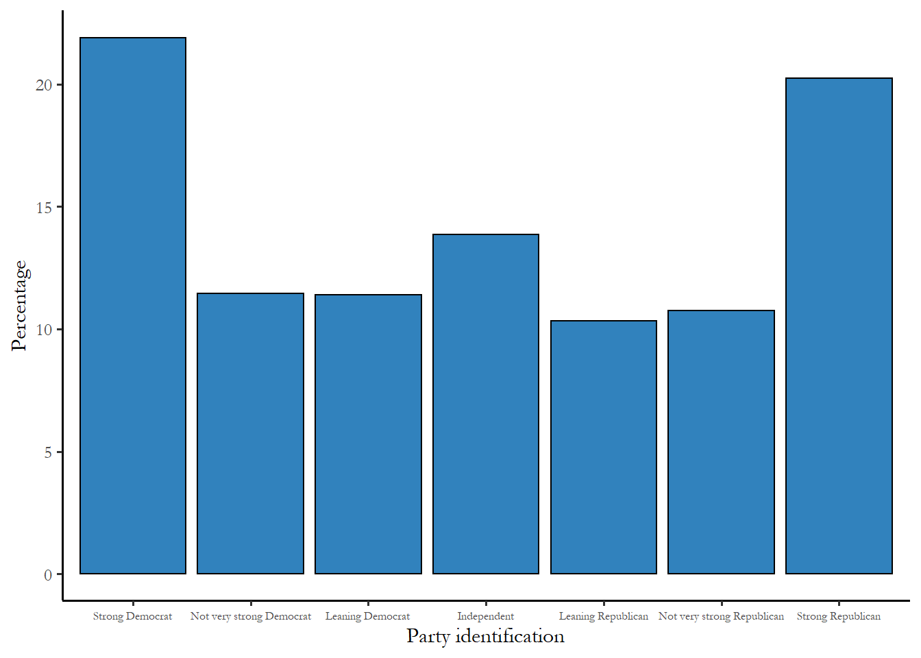
It is clear from the figure that the mode is Strong Democrat, and it appears that the electorate as a whole leans slightly Democratic - two of the three Democratic categories are larger than the corresponding Republican category. This is a good way to see the distribution and to communicate the idea that electorate leans Democratic. But we need a more precise way to both describe this distribution and to compare distributions we might observe for two different groups.
How has this distribution changed over time?
You might be curious about the proportion of the electorate that identifies with Democrats or Republicans today, compared to what we saw during the Bush administration or Obama administration. A long view of the balance between Republican and Democrats is reproduced as Figure 2.4 , below. This is from the ANES and based on the 7-point scale we used above. The figure shows you the the total percentage of women and men who identified as some type of Democrat (1,2, or 3) You can see the Democrats enjoyed a substantial, even overwhelming advantage in the early 1960s, with nearly 2/3 of all American identifying with the party. But that advantage has been decaying for 70 years and support for Democrats continued to erode under President Trump. Today, about 47% of the electorate identifies as some form of Democrat and 45% as some form of Republican. We may, soon, have an election cycle where more people identify as Republican than Democratic, which will come as a surprise to the many people who think that the Republican brand is a demographic corner, doomed to decline as American becomes more diverse and more secular. Also, notice that the support for Democrats decayed more rapidly for men than women, the basis for the contemporary gender gap in presidential voting.
Figure 2.4 Identification with Democrats over time, women compared to men.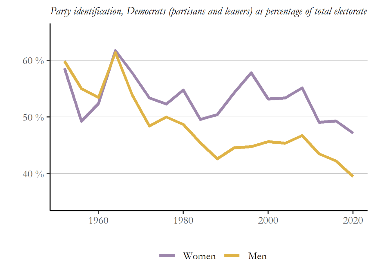
Source: ANES (2021)
2.5 How can we use descriptive statistics?
The output that you will use for the papers and problem sets includes two tables in addition to the bar chart:
the frequency distribution, the percentage of people in each party identification category
the descriptive statistics
Table 2.4 reproduces the descriptive statistics that summarize party identification in the 2020 electorate.
Table 2.4 Descriptive statistics for party identification, entire sample, 2024
| Mean | 3.93 |
| Median | 4.00 |
| Mode | 1.00 |
| Variance | 5.04 |
| Standard deviation | 2.25 |
These numbers tell us a couple of interesting things about party identification.
First, notice the mode (mode=1.00). The most frequent response is Strong Democrat - you can see that on the bar chart too.
Second, remember that the number attached to Independent is 4. Since the mean party id of the sample is 3.93, the electorate is barely leaning toward the lower end of the scale or slightly Democratic.
Finally, the median is 4 meaning the 50th percentile is in the Independent category. The percentages confirm this. Only 47% of the responses are in the first three categories (sum of the first three categories reported in Table 2.3), so the 50th percentile is 4. And only 45% of the responses are in the last three categories. So while the electorate leans toward the Democrats, any candidate, Republican or Democratic, must reach some independents in order to gain support from 50% of the electorate.
We can see that the standard deviation for the entire electorate is 2.25, so, while this doesn’t tell us much, we can use this number as a benchmark to compare groups. If you observe a group with a standard deviation higher than 2.25, then that group is more spread out - more polarized - than the electorate as a whole. If you observe a smaller standard deviation, then the group is more concentrated in a few party id categories.
2.6 Comparing two groups
In many cases we are less interested in the electorate as a whole and more interested in the distribution of some variable for a particular group. To isolate and examine a particular group we use select a subset of cases for analysis. The output for the first problem set and first paper allow you to compare the party identification data for two different groups. To give some sense of how you use the output, I will focus on differences between men and women.
Most media coverage you hear suggests that women have distinct political preferences and vote Democratic, while men are more likely to be Republicans. Much of the coverage immediately after the 2016 election suggested that White women voting for Donald Trump was a surprise, especially given that his opponent was Hillary Clinton. In fact, White women have voted for the Republican presidential candidate in every election since 1980, with the exception of 1996 and 1992. So exactly how different is the party identification of men and women? We expect that women are more likely to be Democrats, but maybe not by much.
The output below reproduces the frequencies and descriptive statistics for men and women using the same format as you will see in output for the problem set and paper. The figure and the first table are exactly the same information, just presented two different ways. You should use both the percentages and the statistics you produce in your paper and Problem Set 1.
Women, 2024 ANES
| Frequencies (weighted, percentage) | |
|---|---|
| Strong Democrat | 24.85 |
| Not very strong Democrat | 15.04 |
| Leaning Democrat | 11.44 |
| Independent | 6.73 |
| Leaning Republican | 11.38 |
| Not very strong Republican | 9.84 |
| Strong Republican | 20.72 |
| Descriptive statistics | |
|---|---|
| Mean | 3.77 |
| Median | 3.00 |
| Mode | 1.00 |
| Variance | 5.28 |
| Standard deviation | 2.30 |
Men, 2024 ANES

| Frequencies (weighted, percentage) | |
|---|---|
| Strong Democrat | 20.09 |
| Not very strong Democrat | 8.23 |
| Leaning Democrat | 15.09 |
| Independent | 7.92 |
| Leaning Republican | 17.62 |
| Not very strong Republican | 11.11 |
| Strong Republican | 19.94 |
| Descriptive statistics | |
|---|---|
| Mean | 4.08 |
| Median | 4.00 |
| Mode | 1.00 |
| Variance | 4.70 |
| Standard deviation | 2.17 |
Interpreting the descriptive statistics
Mean
Notice that while the mean for both groups is between 3 and 5, these responses are in no way typical – the most common responses are 1 and 7. So average doesn’t mean typical when you are looking at distribution that has two peaks, known as a bimodal distribution. The means are close – women a bit lower than 4, so leaning Democratic while men are a bit higher than 4 so leaning Republican. This immediately suggest that any expectation that women are overwhelmingly Democratic and men overwhelmingly Republican is way off the mark.
Mode and median
The statistics do reveal some important differences: while women and men have the same mode (Strong Democrat), the median is different -neither party has a majority among men, but a majority of women are Democratic identifiers, consistent with the figure above.
Standard deviation
Both groups are spread out across the seven categories, rather than concentrated in a few categories near the mean. The smaller number is men, so men may be slightly more likely to be in the categories closest to the mean: 3 and 5, in particular. But these distributions and the numbers are very similar.
Putting in at all together
Women lean slightly more Democratic than men: the average party id for women is 3.77 while the average party id for men is 4.08. The median for men is 4.00, so neither party has a majority in that group - about 48% of men are some type of Republican. Somewhat surprising given the mean, the most frequent response for men is “Strong Democrat” - 20%, and the most frequent response for women is “Strong Democrat” - 25%. The second most common response for both groups is the opposite category of strong partisan identifier - so lots of Strong Republican women. Since the distributions are so similar in that way, the standard deviation for both groups is about the same (close to 2.2). One surprise to me was that the while women leaned Democratic, there was higher percentage of women who identified as Strong Republican (21%) than men (20%). This is a small difference but very unexpected.
To fully describe the party identification of each group, we used the descriptive statistics and the percentages. We can be much more precise in our comparisons using these numbers, rather than simply describing distributions and whether they are skewed or lean or indicate one party has more support than other.
2.7 What’s next?
The way that we approach group differences in this chapter was deliberate and systematic in the sense that we came up with some expectations or hypotheses to test. Based on media coverage of US elections, we expected that women and men would have very different party identifications. This turned out to be wrong. Had we started with a more formal effort to come up with a hypothesis, we might have seen this coming. When it comes to basic human behavior – whether you approach things from the perspective of a sociologist (what is our identity?), a psychologist (what are our habit?s) or an economist (what are your preferences?) – you would be hard-pressed to make the case that women are fundamentally different from men – at least in ways that are politically relevant. (It could be and is the case that women occupy different social and economic positions than men – lower paid, for instance, that might impact political choices.) For a broader discussion of the ways that gender differences can or might matter, you could take a look at the third chapter of a recent book on women’s voting behavior, A Century of Votes for Women (Wolbrecht and Corder 2020).
A second challenge of the approach we take in this chapter is that we are simply describing differences in the ANES sample. How can we know if these differences in party identification – which are fairly small – actually tell us anything about the broader population of women and men in the US electorate? We need to have ways to test if the group differences we observe permit us to make an inference about group differences in the population. That is the focus of the next three chapters.